Göteborg Konstmuseum
A utilitarian iOS app for a museum in Sweden, allowing visitors to experience the space in a more meaningful, guided way, as well as help those outside the museum to get in and even visit Konstmuseum without ever leaving their home (thanks COVID).
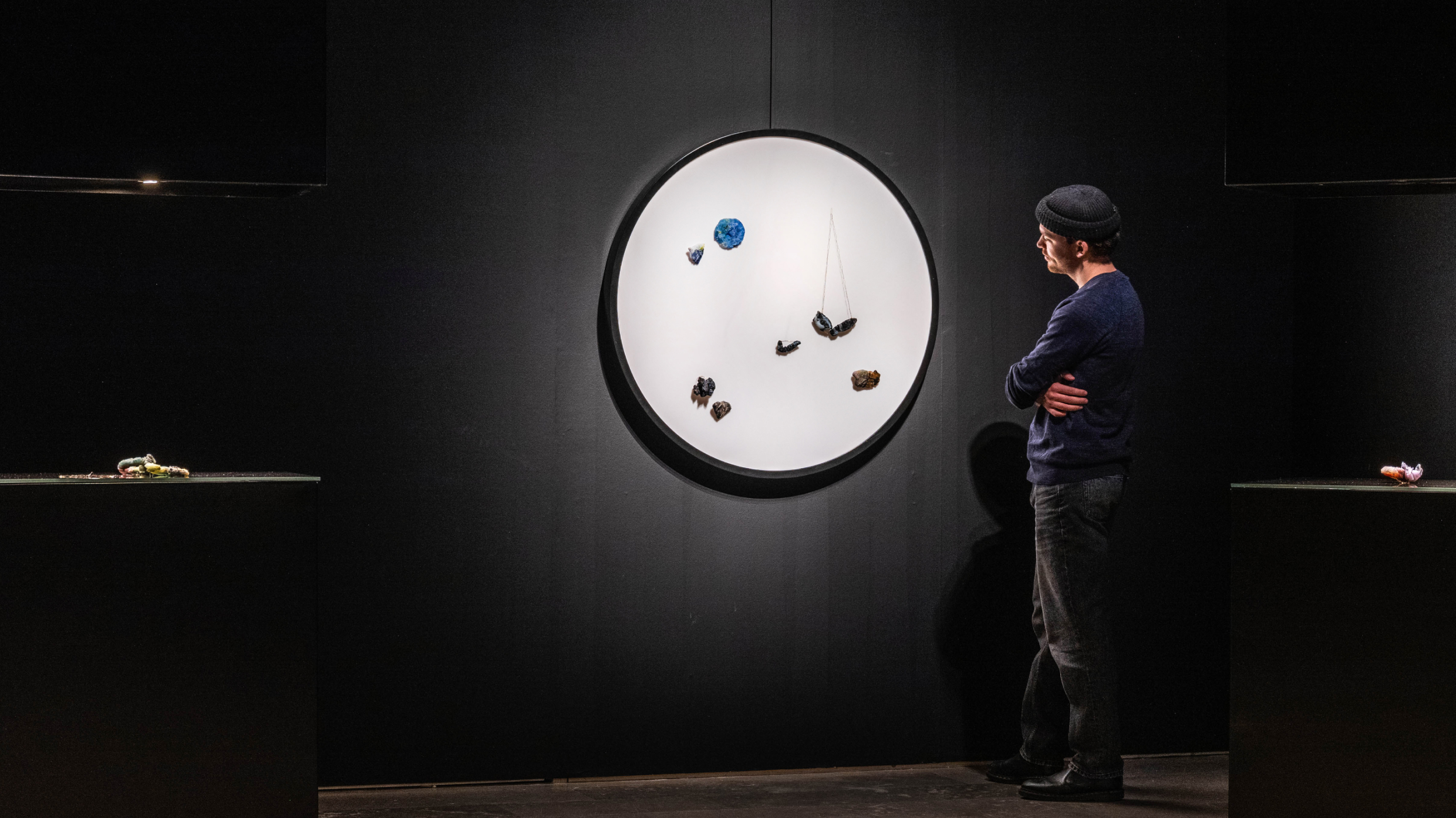
I’m in love with Museum’s logo and tried to find a rhyme to it in the interface which led me to this concept of stacking colorful sections together, sort of playing off the pattern of the arches from the logotype.
The navigation became extremely intuitive and fitting to a very wide range of Museum’s visitors. The colorful sections were always in sight and tapping on them would bring you back to the Home screen.

In the Today tab each Exhibit section invited the users to book a free tour with their ticket right on the same page, blurring the line between browsing and planning further, all building up to one seamless digital-meets-physical experience.

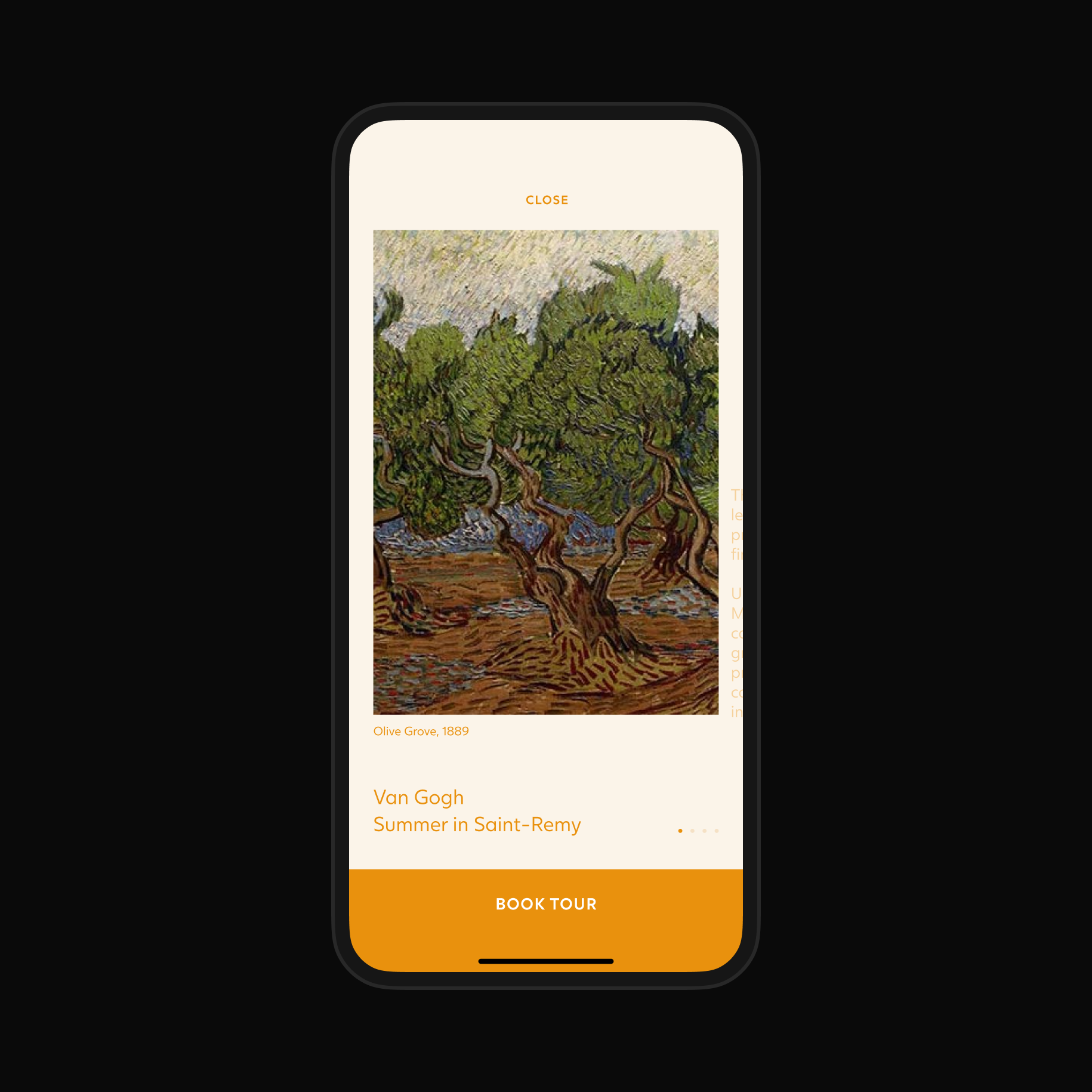

The process of booking tickets was simplified to its core—simple step-by-step flow would not let anyone get lost.


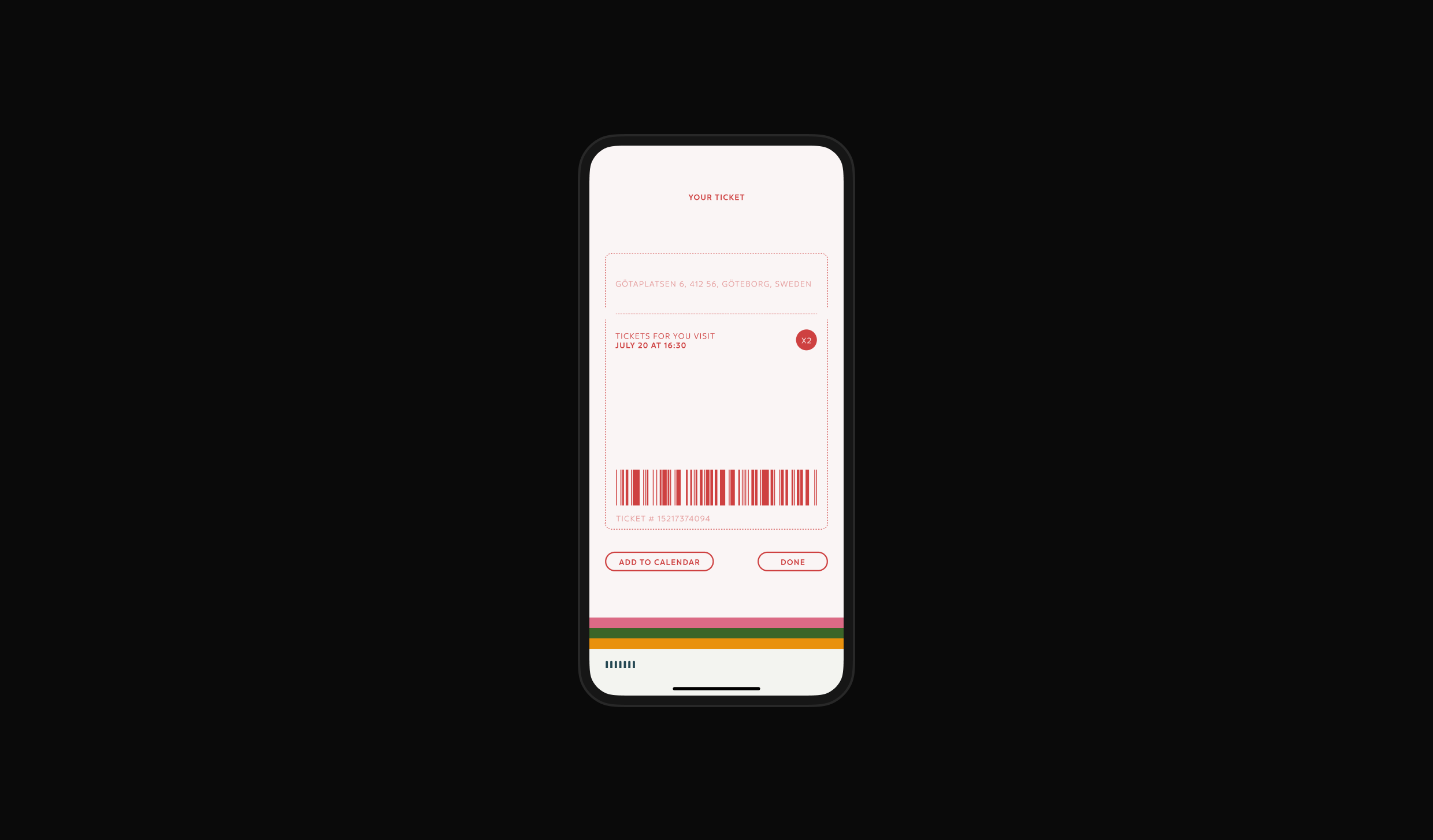
In light of global pandemic lockdowns we added a feature of a virtual tour, allowing art lovers to bring some of the Konstmuseum’s exhibits straight into their home.

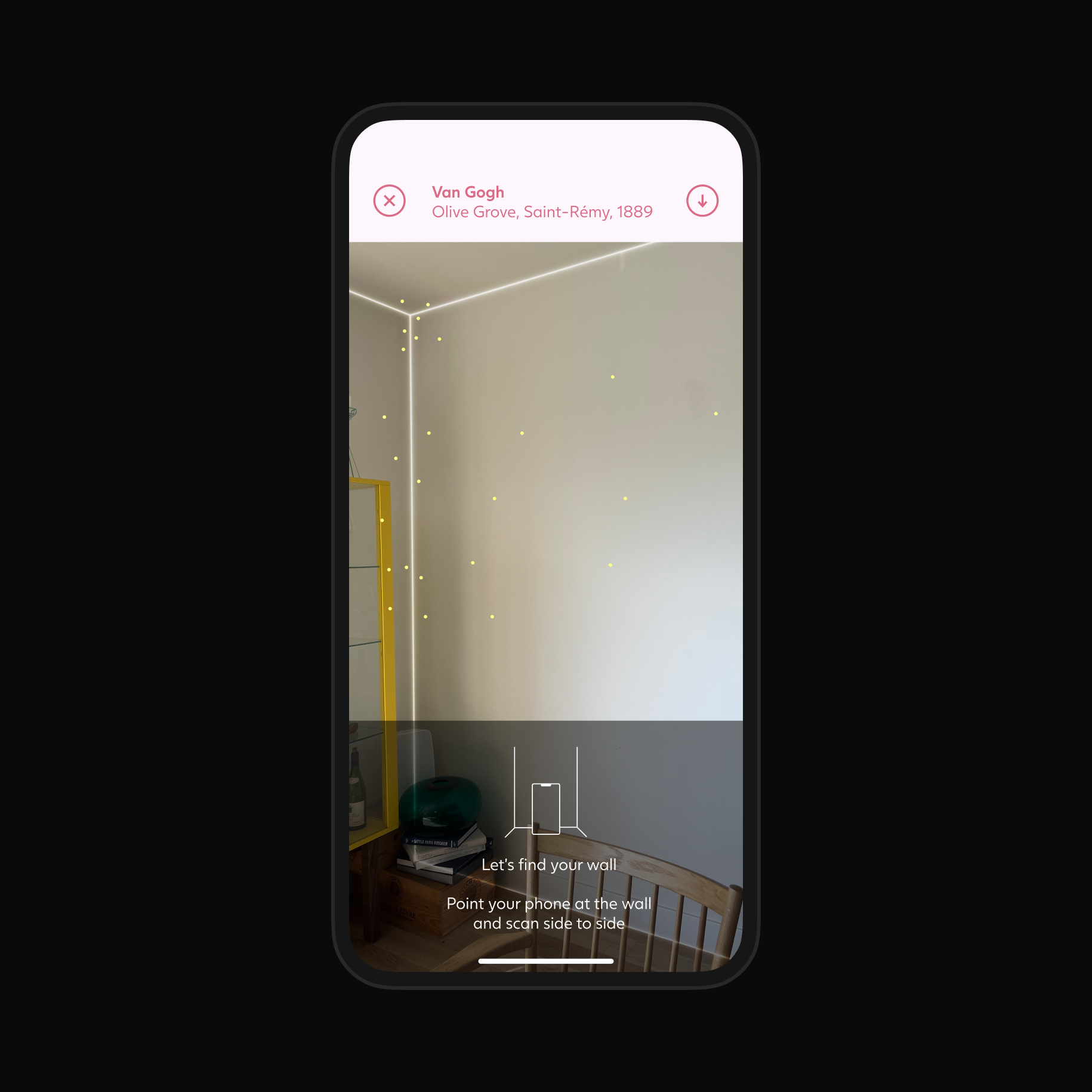


When you would get to the Museum, the app would sense your presence and switch into on-site mode, focusing on checking-in, tours and navigation.


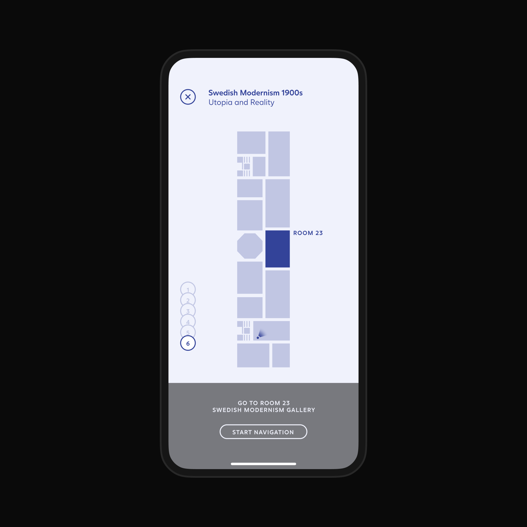
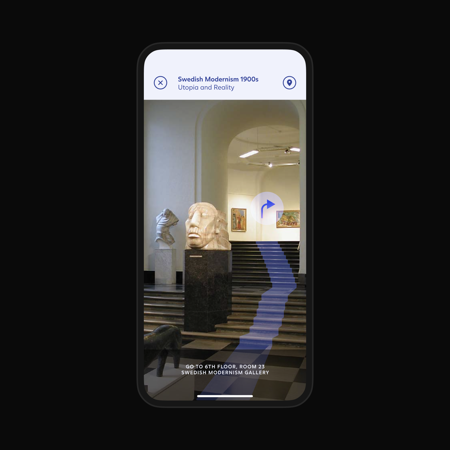
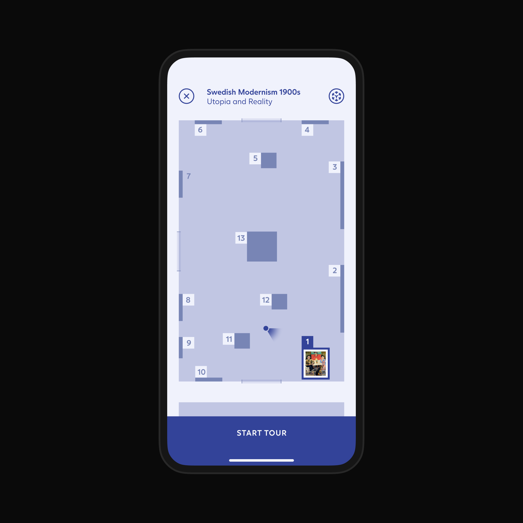
Both traditional maps and AR navigation would guide you around the museum, never letting you get lost or miss an artwork in an exhibit. We combined the navigation functionality with art tours and audio guides, letting you experience Konstmuseum at your own pace.


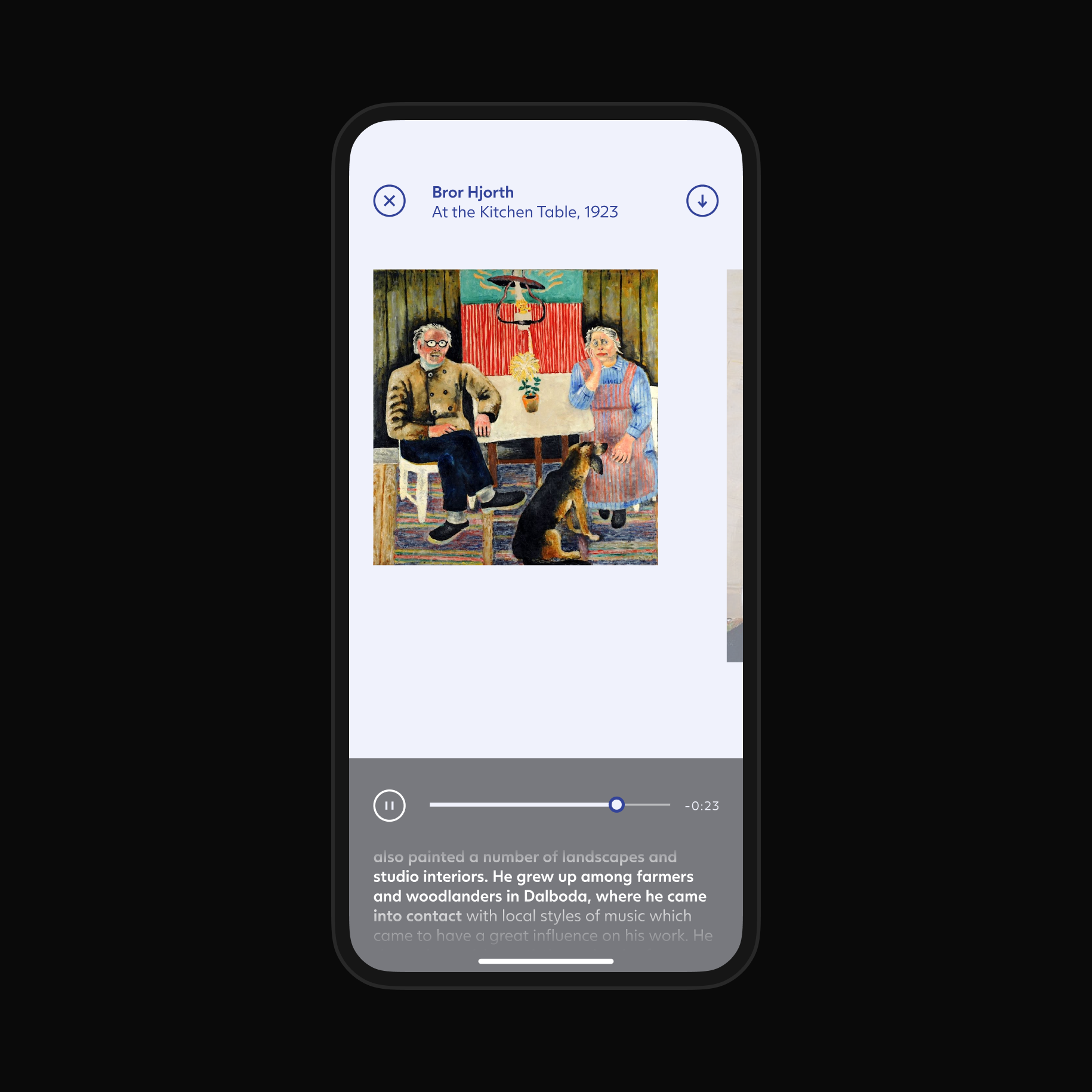
Lastly, the Audio Tours and Art Lookup were made into their own section if you knew your way around the space and just wanted to learn a bit more about a particular artwork.


