carrel:
A web-based application for reading books that are worth reading. To differentiate from other similar platforms we introduced a hybrid way of digesting these highly curated collections of publications, allowing users to switch between reading, listening, browsing images or combining the methods.
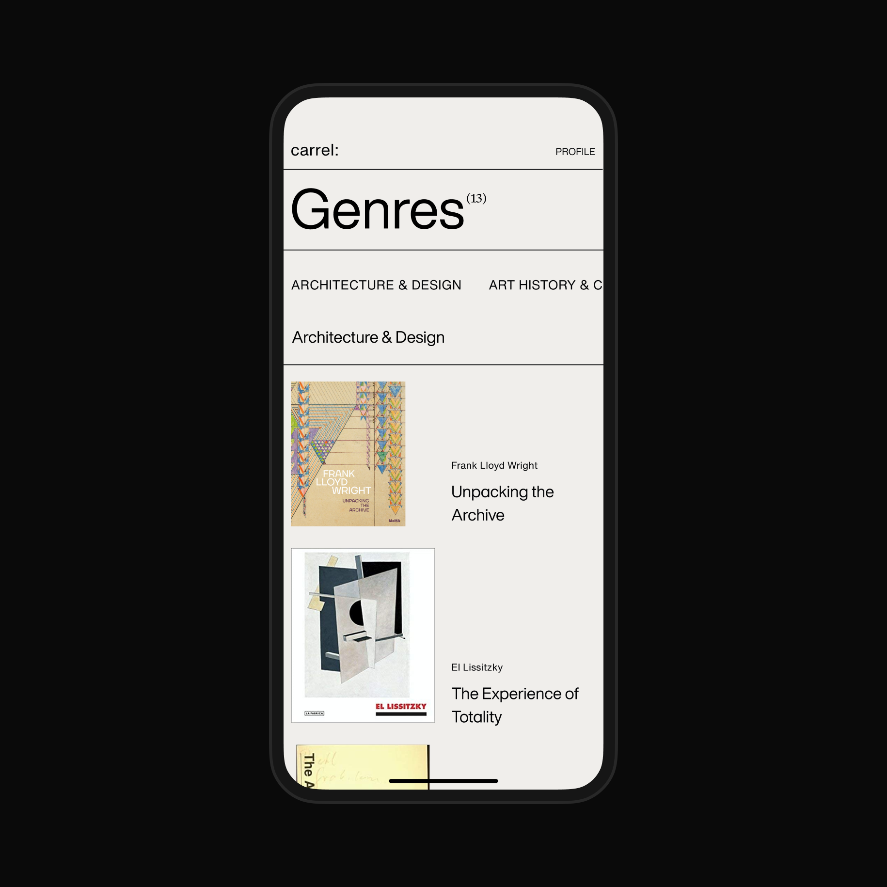
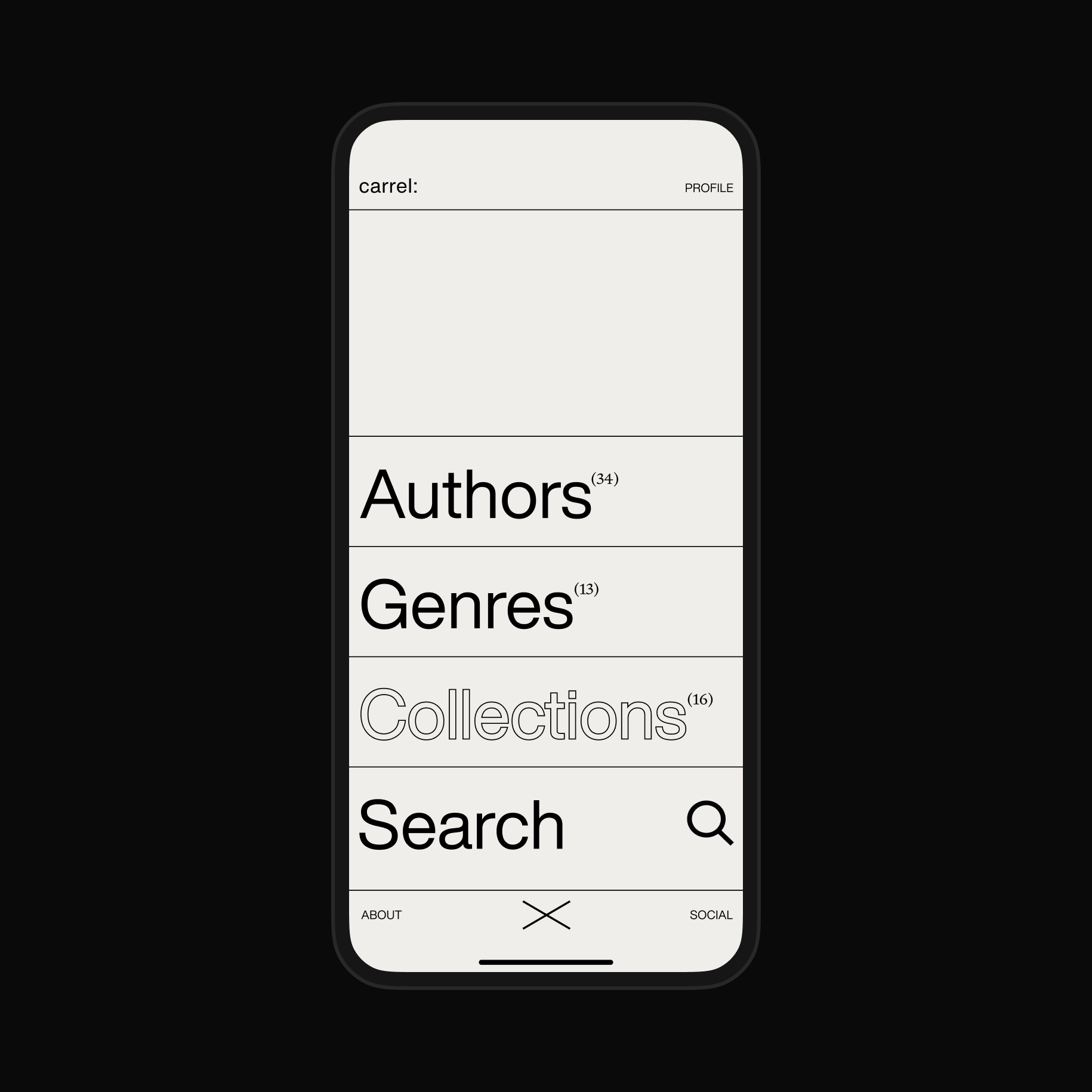
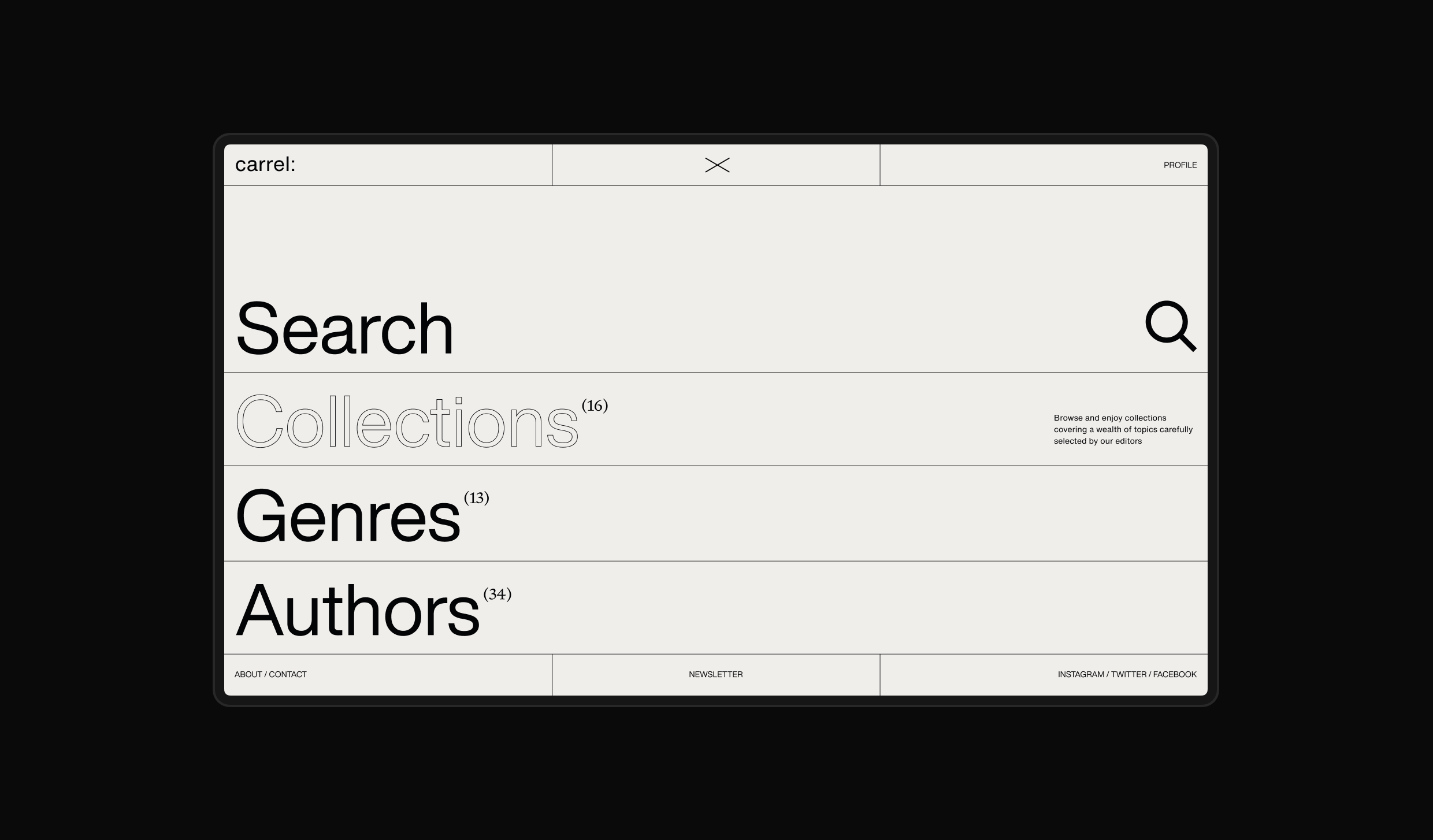
Simple navigation exposed the structure of the site, as well as provided a glanceable overview of content depth.

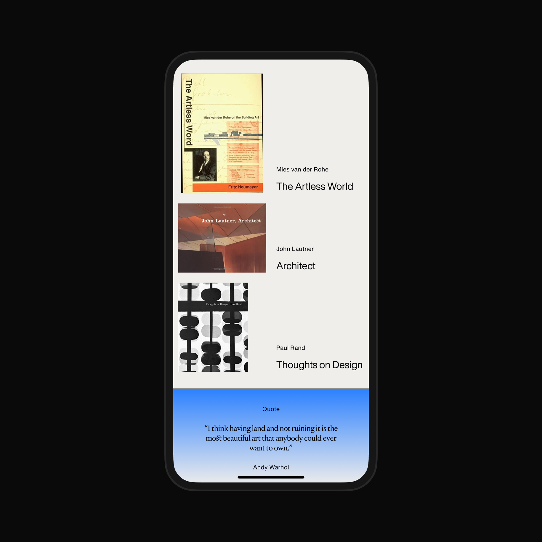
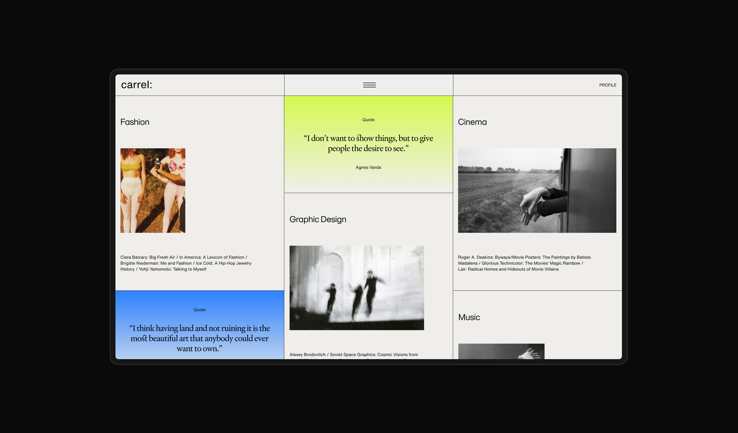
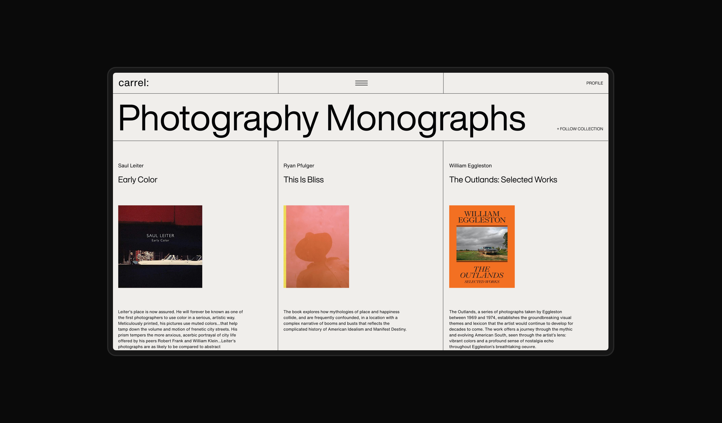
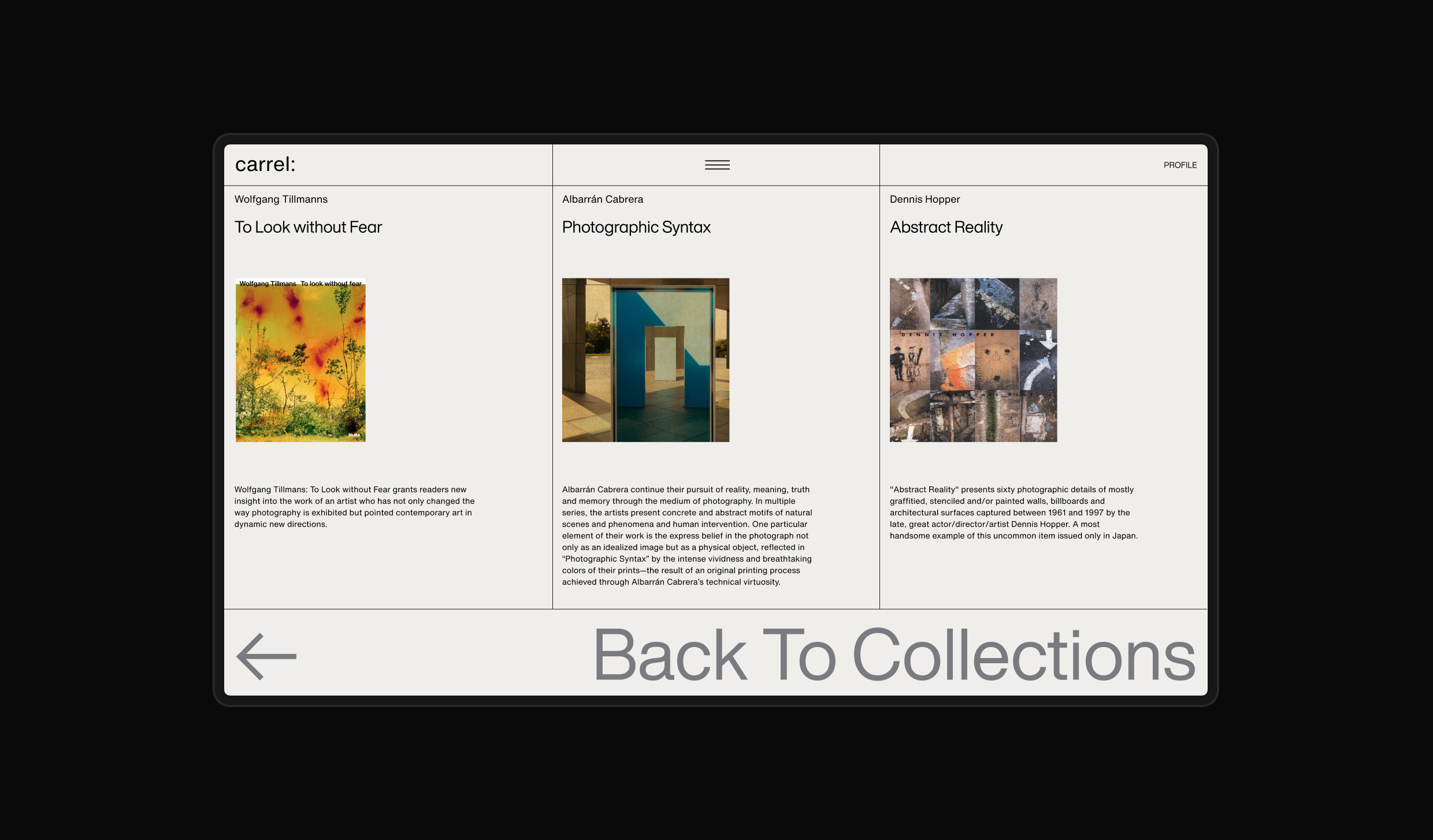
Since the founding principle for the Application was based on meticulous curation, Collections were our primary focus and we really wanted to make them pleasant to browse on their own. We tried to put the spotlight on the beautiful publications themselves, moving the interface out of the picture.


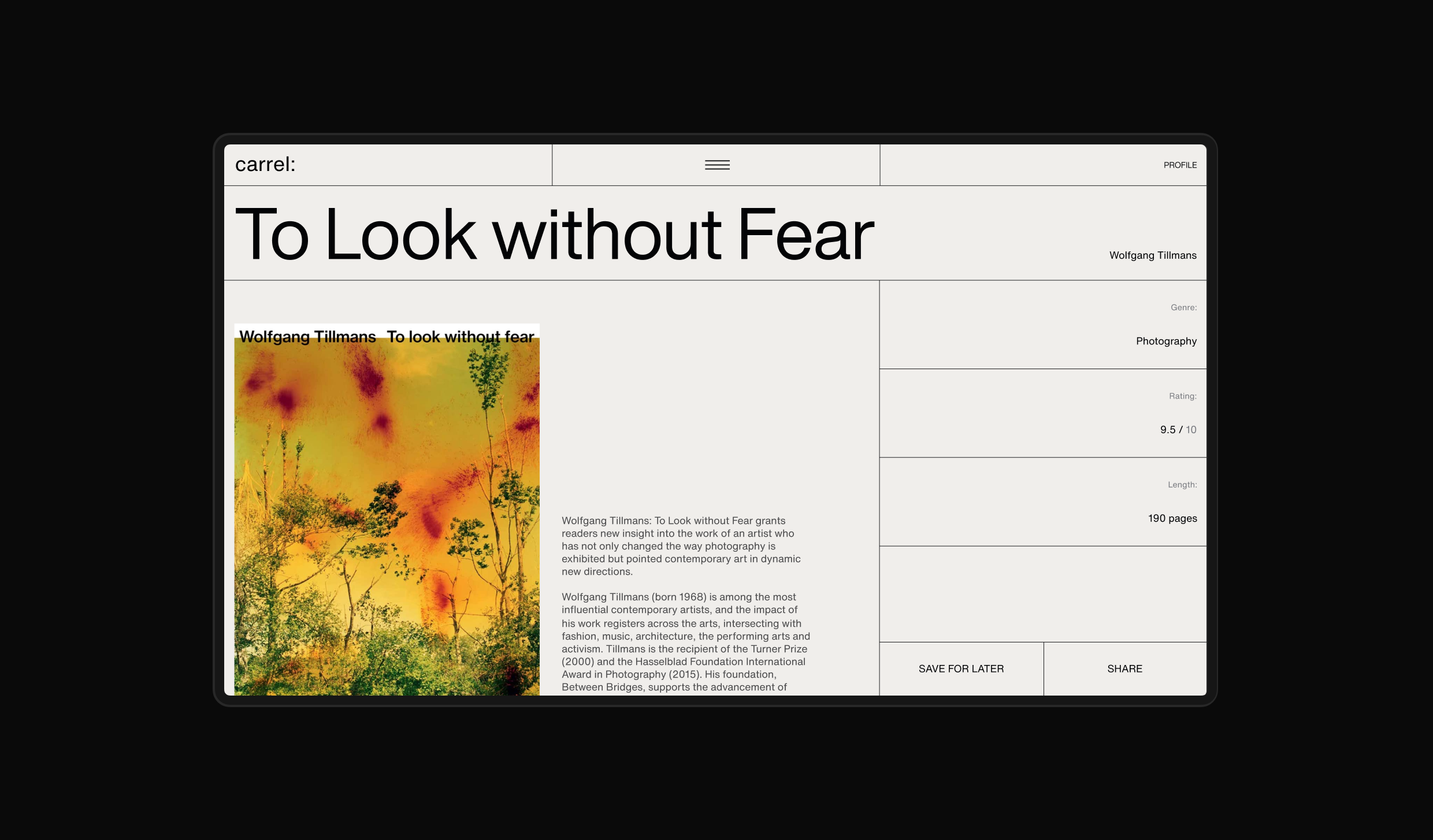
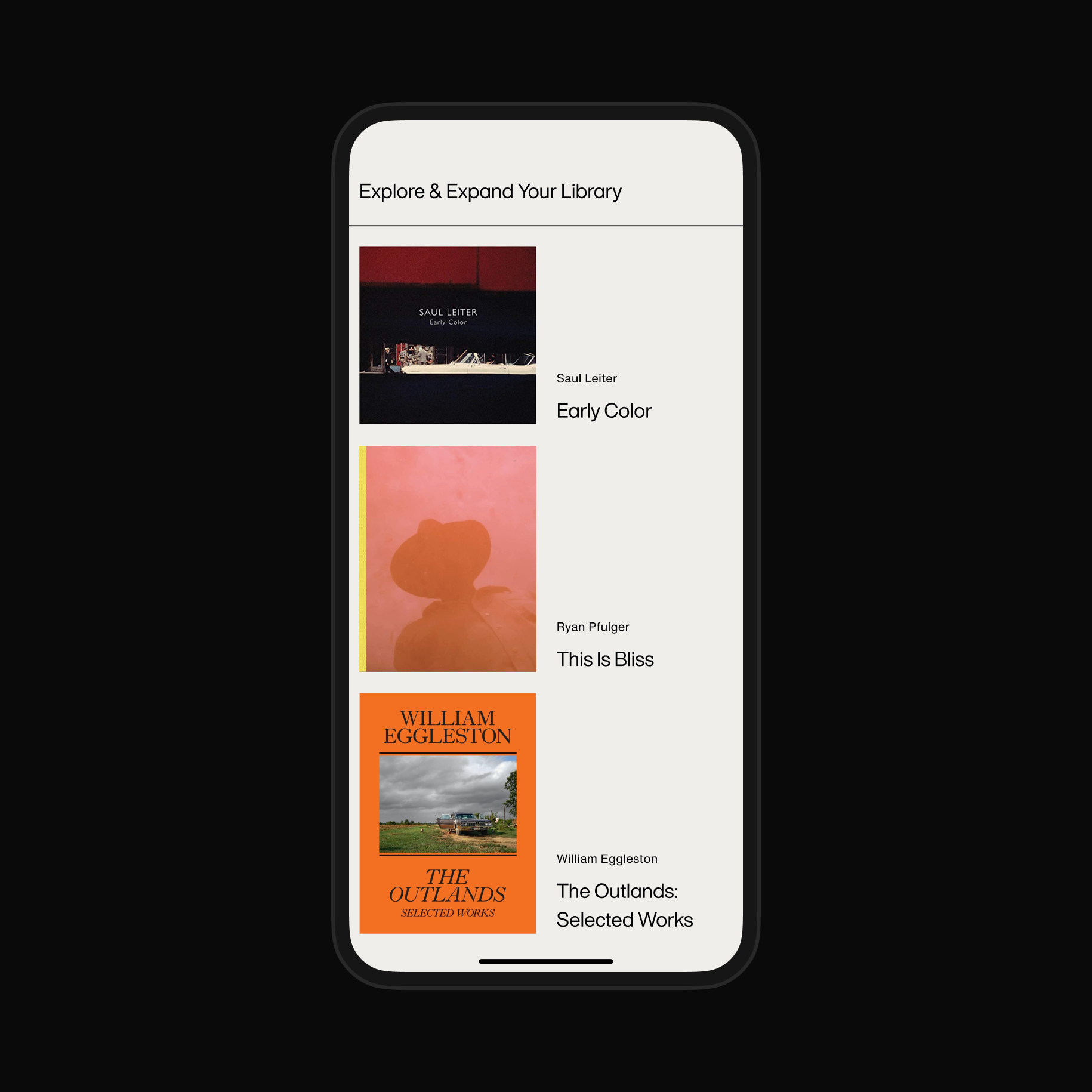
Individual Book pages as well as user’s personal collections received equal amount of love and attention—all listening to the simple, yet very flexible and robust grid system.
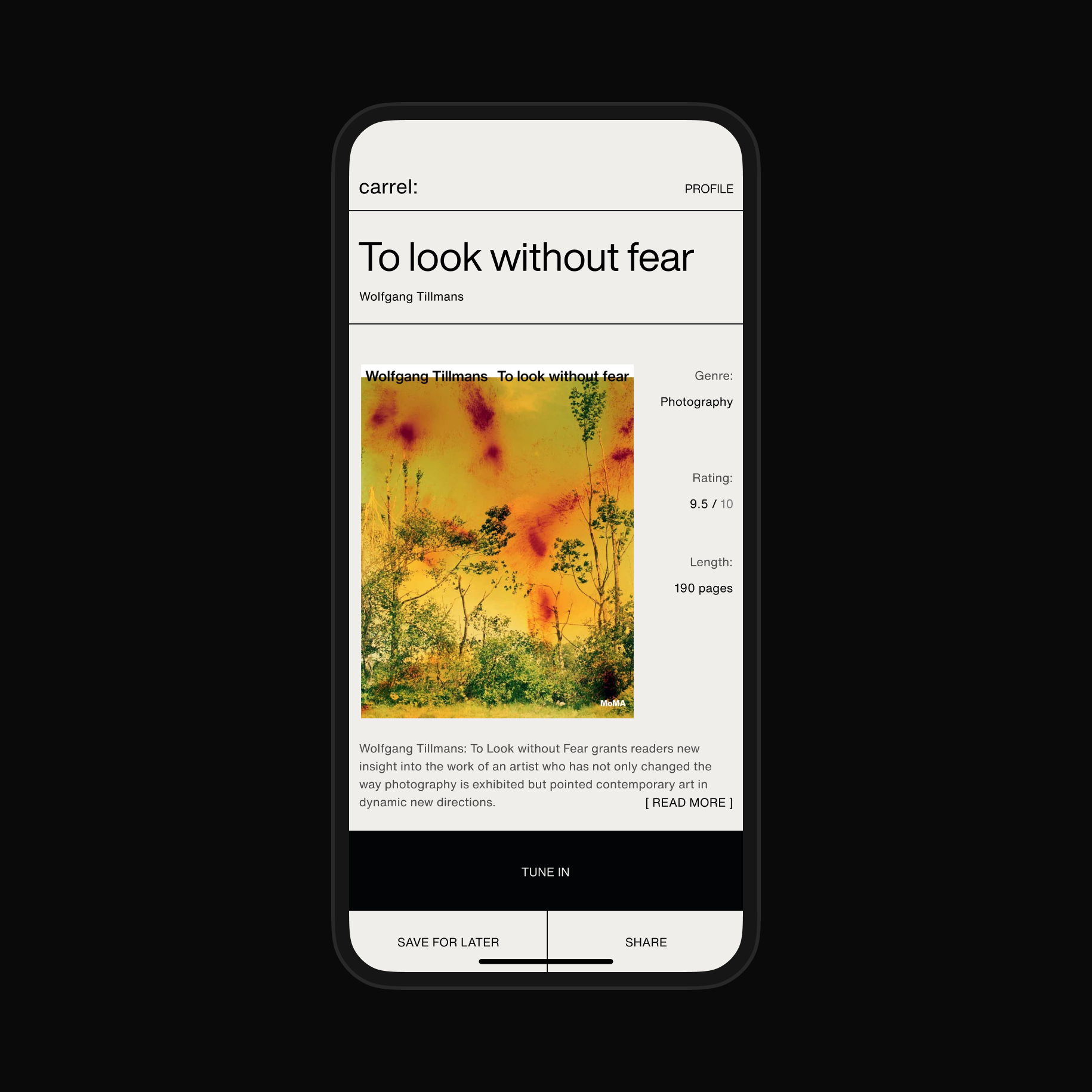
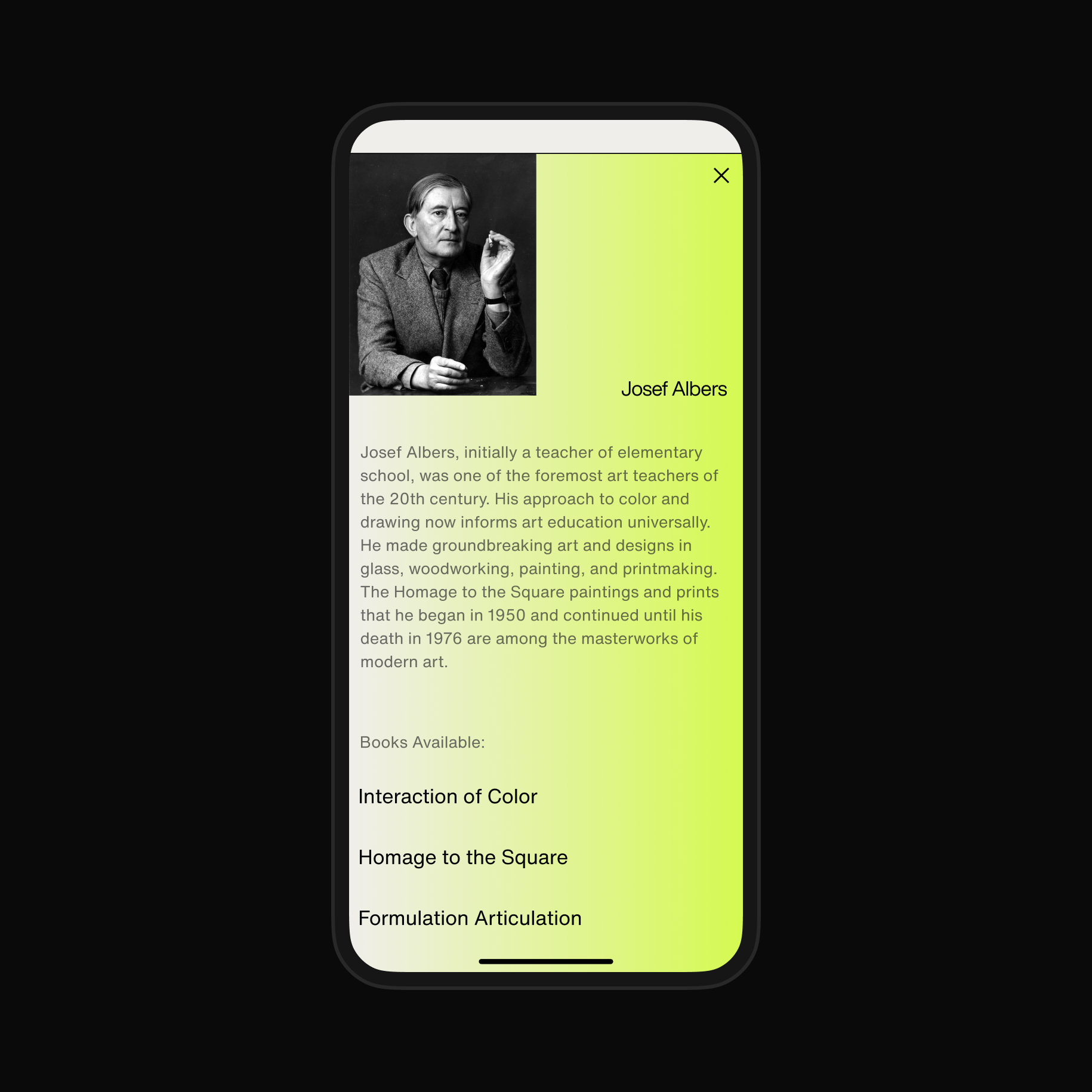
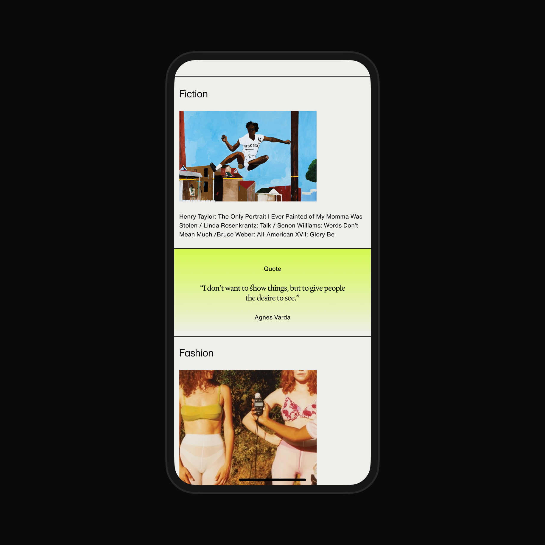
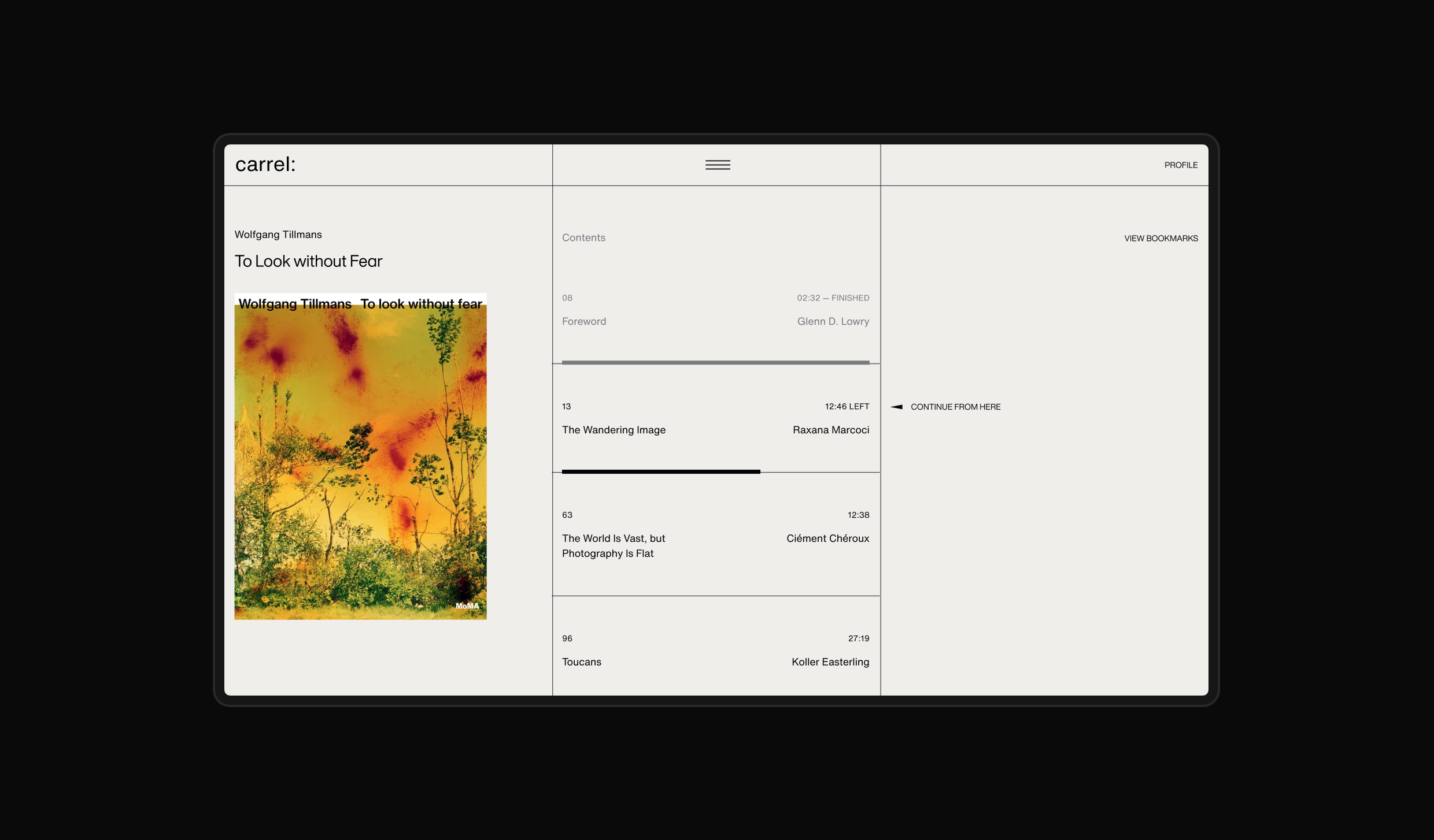
The Player allowed for flexible listen/read/look experience, drawing users in with large imagery and at the same time letting them follow along the text content, all supported by calm, clear and understated typography choices.


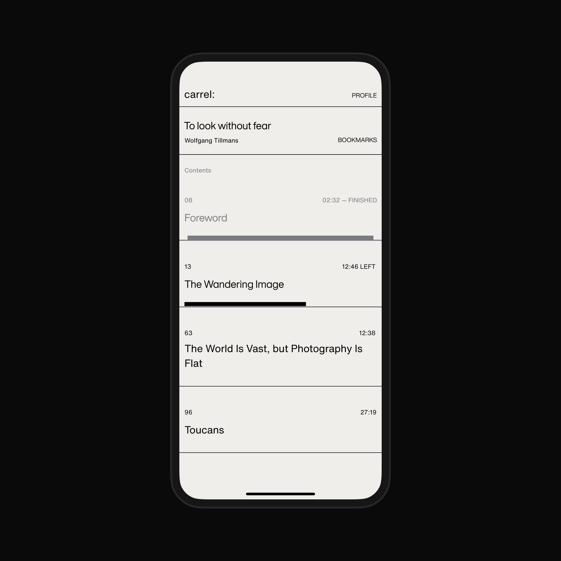
Most books aren’t read in one sitting, so we made picking back up a joyful and seamless process.
Genres and Authors received well deserved spotlight on the platform. Delicate color highlight helped made the page expressive.